
Quick answer: place a men’s brooch where its outline can be read clearly against the garment. A lapel is the easiest starting point for tailoring, an upper-chest or pocket-edge position creates a more casual focal point, and a collar or knit-layer placement works best when the brooch remains visually separate from buttons, seams, and other jewelry.
A brooch can change a jacket or shirt with one small focal point, but the result depends less on a fixed rule than on where the eye lands. The garment supplies lines through its lapel, collar, pocket, shoulder, and buttons. The brooch either follows one of those lines or deliberately interrupts it. Choosing that relationship first makes the accessory look intentional.
Current fashion coverage gives the category useful context without creating a rule for every buyer. Vogue Business identified brooches and tie pins in its Fall/Winter 2026 menswear forecast, while British Vogue documented brooches across several Autumn/Winter 2026 runway placements. Those dated examples show variety; they do not prove that one position, motif, or product is universally fashionable.
Choose the garment zone before the brooch
Begin with the garment you will actually wear. A structured blazer provides a defined lapel and pocket line. A casual jacket offers seams, pockets, and panels. A shirt provides a collar, placket, and upper-chest field. A knit layer may present a broad uninterrupted surface. Each creates a different frame for the same brooch.
Stand in front of a mirror and identify the clearest open zone. The best starting location is usually the area with enough negative space for the brooch outline to remain visible. Avoid deciding from a close product photo alone. Product photography explains the object; a full-outfit view explains its placement.
| Garment zone | Visual effect | Placement question |
|---|---|---|
| Jacket lapel | Formal, directional focal point near the face | Does the motif follow or contrast with the lapel angle? |
| Upper chest | Clear statement on a broad field | Is there enough open fabric around the outline? |
| Pocket edge | Connects the brooch to a visible garment feature | Does the design read as part of the pocket line? |
| Collar area | Compact detail close to the face | Will it compete with collar points, buttons, or neck jewelry? |
| Knit or outer layer | Strong contrast against a simple surface | Can the full silhouette be seen at normal distance? |
Use the lapel as a visual guide
A lapel already creates a diagonal line, which makes it a useful reference. Compact brooches can sit within the lapel field. Longer or directional designs can echo the lapel angle or cross it for a deliberate contrast. There is no single correct side in this style framework; choose the side that works with the garment closure, pocket details, and other accessories.
Position the brooch, step back, and check whether it looks connected to the lapel rather than floating beside it. If the brooch contains a clear head, tail, wing, or long pin, rotate it through several angles before deciding. Orientation can change the visual movement more than shifting the piece a small distance.
Separate brooch, lapel-pin, and stick-pin silhouettes
Retail names overlap, so use visible form instead of relying only on the label. A compact brooch reads as a self-contained shape. A lapel pin often presents a smaller top motif with a narrow vertical or angled element. A stick-pin silhouette is long and directional, with much of its visual identity coming from the line below the motif. Pocket brooches may use two visible components or a design that appears to move across a pocket edge.
These descriptions help with composition; they do not certify a fastening system or garment use. Study the current listing photos from the front, side, and back. Confirm what is included and how the piece is shown before treating a retail name as a complete specification.
Match scale to the available space
Scale is the relationship between the brooch and the garment zone around it. A small motif can disappear on a wide overcoat lapel, while a long design can dominate a narrow collar. The answer is not that large is bold and small is subtle in every outfit. Contrast, edge shape, and surrounding detail also affect how large a piece appears.
Use the garment’s visible features as measuring references. Compare the brooch width with the lapel width, pocket opening, collar point, or distance between seams. If the motif nearly fills the zone, it becomes the lead accessory. If it occupies only part of the zone, it can support a tie, ring, or other focal point.
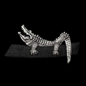
The current MENSSKULL Flying Crane Brooch lists a 32 x 36 mm size and a 6.2 g weight. The Crocodile Pocket Brooch lists 54 x 33 mm and 12.7 g. Those are item-specific catalog facts useful for comparing visible scale; they do not establish a universal garment match or performance outcome.
Let orientation support the motif
Directional motifs create an implied line. A flying bird can appear to move upward, across, or into the lapel. A long animal form can follow a pocket edge. A vertical stick-pin can reinforce the line of a jacket opening. Try to identify the design’s strongest direction before choosing the location.
Orientation also affects negative space. An angled piece may leave room for a tie knot or collar. A horizontal design may connect visually to a pocket opening. A vertical design can occupy a narrow area without spreading across the chest. Take a straight-on and three-quarter photo to see whether the chosen angle remains readable outside the mirror.
Build one clear accessory hierarchy
A brooch sits close to the face, so it can compete with glasses, neckwear, earrings, and necklaces. Decide which element should lead. If the brooch is detailed or large, keep nearby accessories quieter. If the brooch is compact, a stronger ring or bracelet can carry more visual weight at a separate level of the outfit.
The jewelry and glasses-frame guide explains the same lead-versus-support principle for eyewear. For a wider outfit system, use the men’s jewelry styling guide. This page retains ownership of brooch placement and scale rather than duplicating those broader topics.
| Lead element | Supporting choice | What to reduce |
|---|---|---|
| Detailed brooch | Simple ring or quiet wrist piece | Competing chest-level motifs |
| Bold tie or neckwear | Compact brooch with open space around it | Extra collar-level detail |
| Statement glasses | Lower or smaller brooch placement | Several strong face-level focal points |
| Minimal jacket | One larger or directional brooch | Unrelated small accents scattered across the outfit |
| Patterned garment | Clear outline and controlled placement | Motif density that disappears into the pattern |
Place a brooch on casual jackets and shirts
Casual garments do not remove the need for structure; they simply provide different lines. On a workwear-style jacket, the upper pocket, seam, or panel can frame the brooch. On an overshirt, the collar and placket create a compact visual grid. On a plain shirt, the upper chest offers more open space, so even a modest motif can become prominent.
Do not assume that every pin suits every fabric or garment construction. This guide addresses appearance only. Inspect the garment, the brooch hardware, and the maker’s instructions before use. If the question involves fabric damage, snagging, pin security, or garment care, style evidence is not sufficient to answer it.
Use current product examples without turning them into rules
Catalog examples are useful when their facts remain attached to the exact product. The current Ruby-Eyed Rabbit Stick Pin lists a 95 x 15 x 11 mm size, 10 g weight, and material wording of “925 silver + Ruby Eyes.” Its long format provides a clear example of a vertical or angled silhouette.
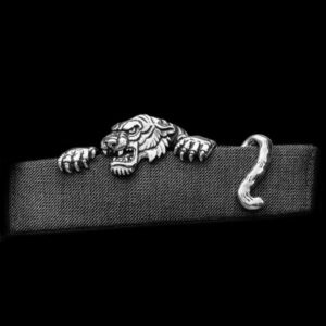
The current Climbing Tiger Pocket Brooch lists 70 x 20 mm, 6.2 g, and 925 silver. Its listing images show a two-part pocket-oriented composition. These observations help buyers compare outline, listed scale, and visual direction. They do not prove durability, fastening security, fabric suitability, popularity, or a preferred occasion.
Browse the silver brooches category to compare current records in one place. Treat the category as commercial navigation, not as evidence that every item shares the same construction, dimensions, or use.
Coordinate finish without making material assumptions
A silver-colored brooch can echo a belt buckle, watch detail, glasses frame, ring, or jacket hardware. Exact matching is optional. Repeating one finish or shape is usually enough to make the outfit feel connected. If the brooch is the only bright metal detail, give it enough visual space to read as a deliberate contrast.
Do not infer composition from color. Use the exact product listing for material wording, and use the 925 sterling silver Research guide for alloy and terminology boundaries. This placement guide does not make material-quality or care claims.
Test placement from three viewpoints
- Front view: check whether the brooch competes with buttons, tie, collar, or the opposite lapel.
- Three-quarter view: confirm that the motif and orientation remain readable when the garment turns.
- Full-outfit view: decide whether the brooch is the lead detail or a supporting accent.
Use normal standing posture and ordinary room light. A close-up can make a small brooch appear dominant and can hide how it relates to the rest of the garment. Change one variable at a time: move the brooch, rotate it, or remove one nearby accessory. This makes the reason for the improvement easier to see.
Common placement mistakes
Choosing from a product close-up only. Compare the piece with the actual lapel, pocket, collar, or upper-chest area.
Ignoring orientation. A directional motif can look disconnected when its strongest line fights the garment.
Making every accessory a focal point. Choose one lead element near the face and let the rest support it.
Using a retail name as a technical guarantee. Brooch, lapel-pin, pocket-pin, and stick-pin labels may overlap; inspect the exact listing.
Treating runway context as a universal rule. Dated fashion coverage can show possibilities, but personal preference and the actual garment still determine the result.
Turning style guidance into a safety claim. Visual placement does not establish fastening security, fabric compatibility, or garment protection.
A six-step brooch placement decision
- Choose the garment first. Identify the lapel, pocket, collar, or open chest zone.
- Name the lead element. Decide whether the brooch or another accessory should be noticed first.
- Compare visible scale. Judge the motif against the width and detail of the selected zone.
- Set the orientation. Align or contrast the brooch’s strongest line with the garment.
- Review three viewpoints. Check front, three-quarter, and full-outfit photographs.
- Verify the exact listing. Confirm included components, dimensions, material wording, current price, and availability before ordering.
A men’s brooch looks intentional when its location, scale, and orientation relate clearly to the garment. Start with the available space, establish one accessory hierarchy, and use the motif’s direction to refine the final position. The result should read clearly at normal distance without relying on a universal side, angle, or occasion rule.


MENSSKULL Journal Notes
Leave a field note
Share fit notes, styling ideas, care questions, or your experience with MENSSKULL silver jewelry.
Comments are checked before publication so buyers can read useful fit, symbolism, care, and style notes without spam noise.
The simple plus/minus challenge below helps block automated spam while keeping the experience lightweight.
Continue exploring
More MENSSKULL stories
Handcrafted silver
Shop the pieces behind the stories