

When an existing tattoo already supplies linework, contrast, and a focal point, jewelry can either support that visual structure or compete with it. The practical question is not what the tattoo means. It is which zone should lead, how much detail is already present, and whether a ring, bracelet, or pendant adds a distinct silhouette or repeats the same visual intensity.
This guide stays with observable styling decisions: placement zone, visible density, negative space, jewelry silhouette, contrast, and focal priority. It does not interpret tattoos, assign identity or cultural meaning, discuss new tattoos or healing, or make claims about skin response, safety, fit, comfort, materials, care, durability, compatibility, or performance.
Quick answer: choose one leading zone
Start by identifying where the existing tattoo carries the most visible detail: hand, wrist, forearm, neck, or upper chest. Decide whether that area should remain the main focal zone. If yes, choose jewelry with a clearer or quieter outline nearby. If no, place one visually stronger jewelry silhouette in a different zone and keep the rest restrained.
Do not try to match every line, motif, or dark area. Repetition can turn several interesting elements into one crowded field. A simpler method is to set a hierarchy: first focal zone, second supporting zone, and everything else quiet.
Separate tattoo meaning from visible composition
A styling decision does not require an interpretation of the tattoo. Two tattoos with different personal meanings can create a similar visual condition if both use dense linework in the same placement zone. Conversely, two tattoos with the same broad motif can create different styling conditions if one is small and open while the other fills a large area.
Use only what can be observed: how much area the ink occupies, whether its lines are sparse or dense, where the strongest light-dark boundary sits, and how much unmarked space surrounds it. This keeps the jewelry decision specific without turning appearance into a claim about identity, personality, culture, or symbolism.
Map the visible placement zones
Divide the composition into zones before choosing an accessory. A hand tattoo shares immediate space with rings. A wrist tattoo sits beside a bracelet and below a watch. A forearm tattoo can become the largest visible field in short sleeves. Neck or upper-chest ink can share the upper-body focal area with a chain or pendant.
The zones do not have to match. A detailed forearm can remain the lead while a ring supplies a small hard-edged accent. A restrained wrist area can carry a bracelet while denser hand detail remains separate. The purpose of the map is to see relationships, not to produce a universal rule.
Placement-zone matrix
| Existing tattoo zone | Nearby jewelry zone | Observable question | Low-competition option |
|---|---|---|---|
| Hand | Fingers | Does the tattoo already create a dense hand focal point? | Use one ring silhouette and avoid repeating several equally active faces. |
| Wrist | Wrist | Do the tattoo edge and bracelet occupy the same narrow band? | Let either the ink boundary or bracelet outline lead, not both at equal intensity. |
| Forearm | Hand or wrist | Does the forearm supply the largest visible field? | Use a smaller adjacent accent with a clearly different outline. |
| Neck | Neckline | Does ink already frame the collar area? | Prefer a plain chain line or one pendant focal point rather than multiple competing forms. |
| Upper chest | Center chest | Would a pendant overlap the same focal area? | Move the jewelry focal point above, below, or away from the densest visible area. |
The matrix describes visual relationships only. It does not establish that a particular item is suitable for contact with tattooed skin or that any placement is safer, more comfortable, or more appropriate.
Read visual density before adding detail
Visual density is the amount of line, shape, and contrast packed into an area. Dense ink can include many short lines, several dark-light transitions, or a broad filled region. Open ink can use fewer marks and more surrounding negative space. Neither condition is better; they simply leave different room for jewelry.
When the tattoo zone is dense, jewelry can contribute through a clean outer silhouette rather than more surface activity. When the tattoo zone is open, a more detailed jewelry face may remain legible because it is not competing with as many nearby marks. Judge the complete view, not a close crop of the accessory.
Use negative space as part of the design
Negative space is the visually quiet area between strong elements. It can be the gap between a hand tattoo and a ring, the open area between a wrist tattoo and a bracelet, or the plain fabric around a pendant. That space helps the eye separate one focal point from another.
Do not assume every open area needs another item. If a tattoo and one accessory already read clearly, leaving the next zone empty can create a stronger hierarchy than filling it with a second ring, stacked bracelet, and pendant at the same time.
Choose silhouette before surface detail
Silhouette is the outer form the eye reads first. A broad signet face, continuous band, compact bracelet outline, plain chain line, and centered pendant each create a different shape before their small details are visible. Compare that outer form against the tattoo’s visible line direction and occupied area.
A clear silhouette does not need to imitate the tattoo. Contrast can be useful: a geometric ring face beside flowing linework, or a simple chain line near a dense upper-body composition. The goal is separation and priority, not a claim that one pairing is universally correct.
Rings with hand or forearm tattoos
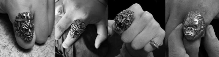
For a hand tattoo, decide whether the ink or the ring should be the first thing noticed. If the tattoo leads, one ring with a readable outline can work as a supporting accent. If the ring leads, reduce competition from additional rings rather than trying to make every finger equally prominent.
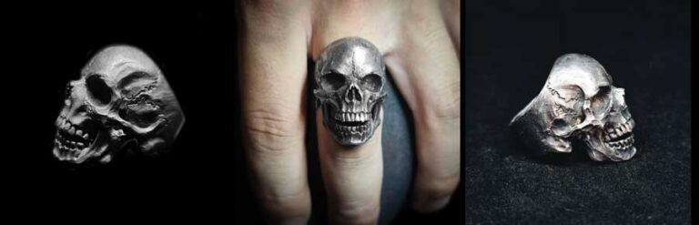
With a forearm tattoo, the ring sits in a separate but connected zone. Compare the full arm-and-hand view. A ring can repeat the forearm’s high density, or it can create a simpler endpoint. The men’s silver rings collection is useful for current commercial browsing, but category placement does not prove tattoo compatibility, scale, fit, or performance.
Bracelets beside wrist or forearm tattoos
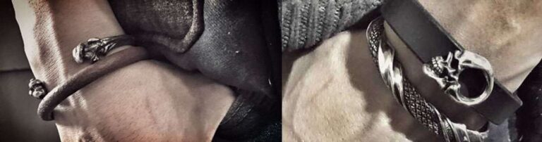
A bracelet creates a horizontal boundary around the wrist. If the tattoo already has a strong edge at the same point, the two boundaries can merge visually. Decide whether the bracelet should reinforce that line or sit as a separate accent with visible space around it.
If a ring is also present, use the ring-and-bracelet placement guide for the separate same-hand composition. Browse the men’s silver bracelets collection for current options only after the focal-zone decision is clear.
Chains and pendants near neck or chest tattoos
A plain chain contributes a continuous line. A pendant adds a concentrated shape. When neck or upper-chest ink already creates a strong focal area, decide whether another centered object will clarify the composition or divide attention.
The plain-chain versus pendant guide owns that specific choice. If a pendant remains the preferred role, the silver pendant necklace collection provides current commercial navigation without establishing on-body scale or tattoo suitability.
One-focal-zone decision sequence
- View the full outfit area where the tattoo and jewelry will appear.
- Name the most visually dense tattoo zone.
- Decide whether that zone should lead or support.
- Choose one jewelry zone: fingers, wrist, or neckline.
- Compare the jewelry’s outer silhouette before its small detail.
- Leave a visually quiet zone between strong elements where possible.
- Remove one item if two zones demand equal attention.
This sequence is a visual editing method, not a rule about identity or acceptable dress. The broader add-or-skip jewelry guide owns the decision of whether jewelry belongs in an outfit at all.
Compare three useful composition patterns
| Pattern | Leading zone | Supporting move | Check before adding more |
|---|---|---|---|
| Tattoo-led | Existing ink area | One simple jewelry silhouette in an adjacent zone | Does the accessory remain distinct without matching every tattoo detail? |
| Jewelry-led | One ring, bracelet, or pendant | Keep other jewelry zones quiet | Is the chosen item still the first accessory read at normal viewing distance? |
| Separated pair | Two distinct zones | Use negative space between them | Can the eye identify each element without their outlines merging? |
These patterns are descriptive, not ranked. A successful choice is the one that produces the intended hierarchy in the actual full view, not the one with the most detail.
Use contrast without inventing a match
Contrast can come from outline, apparent scale, brightness, or surface activity. If the tattoo uses many fine lines, a jewelry piece with a broad, clean shape may separate more clearly than another densely detailed object. If the tattoo uses broad dark areas, a smaller line-based accessory can provide a different visual rhythm.
Photographs can change apparent contrast through lighting, crop, and editing. Compare several product images and the complete outfit view. Do not treat photographic contrast as evidence of materials, finish life, durability, or any physical result.
Common visual-competition mistakes
- Matching every tattoo line with another detailed jewelry surface.
- Stacking several equally strong items in the same small zone.
- Judging a ring or pendant only from a close product crop.
- Using motif similarity as proof that two elements belong together.
- Filling every quiet area instead of preserving negative space.
- Turning a personal visual preference into a universal rule.
None of these mistakes concerns what a tattoo represents. They concern only whether the final composition has a clear priority and whether each form remains readable.
A quick edit before leaving
Take one full-view photograph in the intended outfit and reduce it to thumbnail size. Identify the first focal zone, then the second. If three or more areas demand equal attention, remove one jewelry item and compare again. If the tattoo disappears behind accessory detail, simplify the nearest jewelry silhouette. If the jewelry disappears completely but is meant to lead, move it to a clearer zone or reduce nearby competition.
The thumbnail test is only a composition check. It does not validate on-body dimensions, physical suitability, comfort, skin response, or product quality.
Why this question has public demand
Independent styling publishers have discussed how jewelry and tattoos share visual space. The TattooValue article on combining tattoos and jewelry and Corelune’s jewelry-and-tattoos guide show that readers ask about this coordination problem across hand, wrist, and neckline zones.
Those sources establish that the styling question is discussed publicly. They do not prove tattoo meaning, popularity, product suitability, skin response, healing, safety, fit, quality, durability, or performance, and this guide does not use them for those claims.
Final visual-balance check
State the intended hierarchy in one sentence: “The forearm tattoo leads and the ring is a small endpoint,” “The bracelet leads and the wrist tattoo remains the background,” or “The neck tattoo leads, so the chain stays visually quiet.” If the sentence names one leading zone and one supporting move, the composition has a clear direction.
The dependable method is simple: map the zones, read visible density, preserve negative space, choose one leading silhouette, and remove unnecessary competition. Keep tattoo interpretation, identity, culture, healing, skin, safety, fit, comfort, material, care, durability, compatibility, and performance outside the styling claim.
MENSSKULL Journal Notes
Leave a field note
Share fit notes, styling ideas, care questions, or your experience with MENSSKULL silver jewelry.
Comments are checked before publication so buyers can read useful fit, symbolism, care, and style notes without spam noise.
The simple plus/minus challenge below helps block automated spam while keeping the experience lightweight.
Continue exploring
More MENSSKULL stories
Handcrafted silver
Shop the pieces behind the stories