

Quick answer: read the graphic T-shirt as a visual field before adding jewelry. Mark which area the print already occupies, identify the open neckline, wrist, and hand zones, then give one open zone first priority. A necklace, bracelet, or ring can support the outfit without becoming a second competing picture.
Start with the print, not the jewelry
A graphic T-shirt has its own outline, contrast, lettering, pictures, and empty space. That makes it different from a plain shirt. Before choosing an accessory, look at the shirt from the distance at which the complete upper body is visible. Notice where your eye lands first and how much of the torso the print occupies.
The useful question is not whether graphic tees and jewelry can appear together. It is whether the outfit has a clear visual order. Keep the print first when it already dominates the torso. Give jewelry more presence only when the shirt leaves an open area that can hold another shape without merging into the artwork.
What this guide means by visual density
Visual density describes how many strong shapes, edges, tonal changes, and points of contrast appear in one area. A small chest mark can create a compact point of density. A full-front illustration can occupy nearly the entire torso. Neither is automatically quiet or loud; color contrast, line thickness, spacing, and surrounding fabric all affect what is visible.
Assess the shirt you actually plan to wear. Do not assume that every band tee, logo tee, or illustrated tee creates the same visual problem. The method begins with observation rather than a category label.
Use this print-zone matrix
| Observable print position | Likely occupied zone | First jewelry zone to inspect | Decision cue |
|---|---|---|---|
| Small chest mark | One upper-torso corner | Opposite hand or wrist | Keep the second focal point separated from the mark |
| Centered chest graphic | Neckline-to-mid-torso axis | Hand or wrist | Leave the central vertical line visually clear |
| Full-front print | Most of the torso | One outer wrist or hand | Move detail away from the printed field |
| Low or side print | Lower torso or one side | Neckline or opposite hand | Use the open zone rather than overlapping the artwork |
This matrix is a starting view, not a rule about what anyone must wear. Jacket edges, sleeve length, shirt color, hair, bags, watches, and camera crop can change which zones remain visible.
Small chest marks leave several options
A small chest mark often leaves most of the neckline, both wrists, and both hands visually open. That does not mean every open zone needs an accessory. Choose one zone and compare it against the position of the mark. A ring on the opposite hand can create separation. A bracelet on the same side can create a deliberate cluster. A plain necklace line may sit above the mark if the two shapes remain distinct.
If the outfit still feels scattered, remove one element and compare again. The clearest version is the one in which your eye can identify the print and the accessory without bouncing between several equally strong details.
Centered graphics already own the vertical axis
A centered print often creates a strong line from the collar toward the middle of the torso. A pendant placed directly over that line introduces another recognizable shape in the same field. That overlap can be intentional, but it should be visible as a choice rather than an accident.
Try the outfit with the neckline empty first. Then compare one hand or wrist accent. If you still want a necklace, the plain chain or pendant guide owns the format decision. This page only asks whether the neckline is visually open enough to receive that format.
Full-front prints favor spatial separation
A full-front print can combine lettering, figures, frames, and tonal changes across most of the torso. The simplest comparison is to move jewelry outside that field. One ring or bracelet keeps the accessory visible at the edge of the outfit rather than laying another motif over the shirt artwork.
Separation does not require the accessory to disappear. A clear hand silhouette can remain noticeable while the print retains control of the torso. Judge both from a complete outfit view, not from a close photograph of the jewelry alone.
High contrast changes apparent prominence
Contrast affects how quickly an edge becomes visible. Light artwork on a dark shirt, dark artwork on a light shirt, or a saturated color against a neutral field may attract attention before the print’s physical size is considered. Jewelry can also become more apparent when it sits against a contrasting shirt or uncovered skin zone.
Compare apparent prominence rather than assigning a fixed intensity to a jewelry type. The same simple line can look quiet against one background and distinct against another. Make the judgment in the actual outfit and lighting you expect to use.
Choose one focal zone first
Use this one-focal-zone decision sequence:
- Name the zone the print already owns: upper chest, central torso, full torso, or lower side.
- List the zones still visible: neckline, left wrist, right wrist, left hand, or right hand.
- Choose one open zone to receive the first jewelry shape.
- Check whether the print and accessory can be read separately.
- Add nothing else until the first relationship is clear.
If the shirt already supplies enough detail, the correct outcome may be to skip jewelry. The broader add-or-skip jewelry guide owns that general decision.
Compare the neckline zone
Look at the area between the collar and the top edge of the print. A plain chain contributes a line. A pendant contributes a line plus a separate shape. If the print reaches the collar or includes central lettering, those additions may merge with the existing field. If there is clear fabric space above the artwork, the necklace can remain legible as its own element.
Neckline geometry changes when a jacket is added or the shirt is layered. Recheck the full outfit after the outer layer is in place. Do not rely on the tee by itself if that is not how it will be worn.
Compare the wrist zone
A bracelet moves the accessory away from a busy chest print, but sleeve length and nearby hardware still affect the result. With short sleeves, the wrist may form a separate visible zone. With an overshirt or jacket, the cuff can become part of the same cluster.
For commercial browsing, the men’s bracelet collection shows the current assortment. Use it only after deciding whether the wrist should carry the accessory. Category labels and photographs are navigation, not evidence about material, comfort, care, or performance.
Compare the hand zone
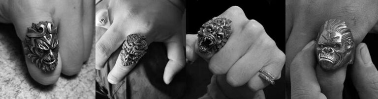
Rings sit farther from the printed torso and can create a compact endpoint when the hands are visible. Compare one ring shape with the overall density of the shirt. A broad face, sculptural outline, or narrow band contributes a different amount of visible detail, but the effect depends on distance, angle, and neighboring accessories.
The men’s ring collection is the current browsing owner. Use its product pages for selectable options and listing details. This guide does not infer scale, fit, material, quality, or value from category names or images.
Decide whether hand and wrist should share attention
A ring and bracelet can form one accessory cluster when they are visually close. That cluster may be useful when the opposite side of the outfit already contains a chest mark, bag strap, or jacket detail. It may feel crowded when both pieces have dense outlines and the graphic print is already complex.
Use the ring-and-bracelet placement guide for the same-hand decision. Here, the only question is whether the combined hand-and-wrist zone remains secondary to the shirt or becomes the intended lead.
Use repeated shape carefully
Repetition can connect distant zones. A straight necklace line can echo lettering; a rounded ring face can echo a circular graphic; a bracelet edge can repeat a frame in the print. The connection does not need to be literal. One shared direction or amount of visual weight is enough to make the relationship visible.
Avoid reading meaning into the repeated shape. Similar geometry does not prove that the shirt and jewelry share a cultural, political, religious, historical, or personal message.
Use separation when shapes compete
If a pendant overlaps a detailed central print, move the accent to the wrist or hand before changing the entire outfit. If a bracelet sits beside a heavily printed long sleeve, move the accent to the opposite hand. These are visual comparisons, not universal prescriptions.
Take one full-frame photograph of each arrangement in the same light. Keeping the camera, pose, and clothing constant makes the difference between zones easier to see.
Print-zone decision table
| What you observe | First comparison | Second comparison | Stop condition |
|---|---|---|---|
| Print and pendant occupy the same center line | Remove the pendant | Try one wrist or hand zone | Print and jewelry read separately |
| Small mark and wrist detail sit on one side | Move the accessory to the opposite side | Compare intentional cluster versus separation | One arrangement has clearer order |
| Full-front print dominates the torso | Leave the neckline open | Compare one ring with one bracelet | Only one outer zone needs emphasis |
| Print is quiet and widely spaced | Test one necklace line | Test one hand accent | The chosen zone leads without duplication |
Browse only after choosing the zone
Once the zone is clear, browse by format rather than trying to solve the complete outfit inside a category grid. The pendant collection owns current pendant browsing, while ring and bracelet collections own their respective formats. Recheck each listing before purchase because availability and selectable options can change.
Do not use this page to assume how an item will sit on a particular body or garment. Product photographs cannot establish universal on-body placement, compatibility, or comfort.
Common graphic-tee jewelry mistakes
- Choosing jewelry before identifying where the shirt print begins and ends.
- Treating every graphic tee as equally dense.
- Placing a pendant over central artwork without checking overlap.
- Filling the neckline, both wrists, and both hands at once.
- Judging jewelry only in a close crop instead of the full outfit.
- Interpreting a shirt graphic or jewelry motif as proof of identity or meaning.
Correct the shortlist by returning to visible zones. Remove one element, keep every other variable fixed, and compare again.
Final graphic-tee balance check
Complete this sentence: “The shirt leads, and the jewelry sits at the neckline,” “the shirt leads, and the jewelry sits at the wrist,” or “the shirt leads, and the jewelry sits on the hand.” If you cannot name the priority, the outfit may contain too many competing focal points.
This guide can compare print position, visual density, open outfit zones, separation, silhouette, contrast, repeated geometry, and focal priority. It cannot determine trend status, popularity, identity, attraction, confidence, cultural meaning, historical meaning, political meaning, religious meaning, fit, comfort, skin response, fabric effects, safe wear, material identity, care, quality, durability, compatibility, value, or performance.






MENSSKULL Journal Notes
Leave a field note
Share fit notes, styling ideas, care questions, or your experience with MENSSKULL silver jewelry.
Comments are checked before publication so buyers can read useful fit, symbolism, care, and style notes without spam noise.
The simple plus/minus challenge below helps block automated spam while keeping the experience lightweight.
Continue exploring
More MENSSKULL stories
Handcrafted silver
Shop the pieces behind the stories