

A dark jewelry composition works when the eye can tell what leads and what supports it. Choose one focal zone, control the scale of each silhouette, repeat only a small number of visible cues, and leave enough space between details. The goal is not to add every dark motif at once. It is to build a clear hierarchy that still reads when the jewelry is seen with the full outfit.
Dark Aesthetic Jewelry Is a Composition Problem
“Dark” can describe many observable features: deep light-dark contrast, angular outlines, dense relief, repeated motifs, heavy-looking proportions, or a limited palette. Those features do not need a historical story or a fixed personal meaning to be styled. Treat them as visual ingredients. The useful question is how the ingredients interact when they appear on a body and inside an outfit.
A product image isolates one object against a controlled background. An outfit adds a jacket zipper, watch face, belt hardware, patterned fabric, buttons, eyewear, tattoos, layered collars, and movement. A design that appears restrained in isolation can become a second or third focal point once those details enter the frame. Composition begins by considering the entire visible field rather than judging each item separately.
This guide owns the dark-aesthetic composition decision. For catalog browsing, use the gothic jewelry category. That destination shows current product families; it is not evidence of history, symbolism, identity, popularity, material, or performance.
Choose One Focal Zone First
The hand, wrist, and neckline are separate visual zones. Pick the zone that should receive attention first. A ring with a broad face can make the hand the focal zone. A bracelet with a strong repeating link can shift attention to the wrist. A pendant framed by an open collar can establish the center line. The decision is not about which category is universally stronger; it is about which location has the clearest visual job in the planned outfit.
Once the focal zone is chosen, other jewelry should support it. Support can mean repeating one finish contrast, echoing one angular edge, or keeping another zone almost empty. If the neckline already has a highly detailed focal piece, a second high-detail wrist and several equally strong rings can flatten the hierarchy. Nothing leads because everything asks for equal attention.
Use one clear ring silhouette and keep wrist or neckline details lower in contrast.
Let link rhythm or bracelet outline lead while rings and pendant act as quieter echoes.
Create open space around the pendant and reduce competing details near the face and hands.
Build a Three-Level Visual Hierarchy
A practical hierarchy has a lead, a support, and a background. The lead is the first jewelry detail noticed from normal conversational distance. The support becomes clear after a second look. The background either repeats a small cue or stays quiet enough to frame the other two. This three-level model is easier to manage than assigning every piece the same importance.
Test the hierarchy by describing the outfit in one sentence. For example: “The pendant leads, the ring repeats the dark edge, and the wrist stays quiet.” If the description needs several “and then” clauses, the outfit may have too many equal-strength details. The test is descriptive, not a rule about what anyone must wear.
| Hierarchy level | Visual job | Ways to control it | Diagnostic question |
|---|---|---|---|
| Lead | Creates the first clear jewelry focal point | Strongest silhouette, clearest contrast, most isolated placement, or highest detail density | Which piece is noticed first with the full outfit? |
| Support | Repeats one cue without competing | Smaller scale, lower contrast, simpler surface, or more familiar outline | Does it reinforce the lead or demand a separate reading? |
| Background | Provides space or a very quiet echo | Minimal detail, similar tone to clothing, or an intentionally empty zone | Would removing it make the hierarchy clearer? |
Control Silhouette Scale Before Surface Detail
Silhouette is the outer shape a viewer can recognize before seeing engraving, relief, or small texture. Compare face width on a ring, the apparent width of a bracelet, and the overall pendant outline. When two large silhouettes sit close together, they can merge into one dense block or compete as separate focal points. Reducing the scale of one creates a clearer relationship.
Start at conversational distance. If the outline reads clearly there, move closer and inspect surface detail. This order prevents fine details from driving a decision that fails at normal viewing distance. The men’s ring category can be used to compare broad, narrow, angular, rounded, and relief-heavy outlines. Use it as visual navigation only, not as evidence for fit, composition, or durability.
Use Finish Contrast as a Visual Cue
Finish contrast means the visible difference between bright and dark areas, smooth-looking and textured-looking areas, or polished-looking and muted-looking surfaces. These are appearance observations from the listing imagery; they are not material or manufacturing conclusions. A high-contrast piece often attracts attention even when its overall dimensions appear modest.
Choose whether contrast belongs in the lead or support role. If a pendant already contains strong light-dark separation, a bracelet with equally sharp contrast may create a second lead. A quieter bracelet can repeat the general tone without duplicating the visual intensity. Conversely, a low-contrast neckline leaves room for a stronger wrist detail.
Limit Motif Density
Motif density describes how often recognizable shapes repeat across the visible jewelry. One detailed motif can read as a focal object. Several different motifs across rings, bracelet, pendant, belt, and clothing can become difficult to parse. Repetition is clearer when it is deliberate: one motif leads, one supporting piece echoes an edge or texture, and unrelated motifs stay out of the same composition.
Do not infer a fixed meaning from a motif. A skull, cross, animal, geometric frame, or architectural shape can be chosen for its outline and visual relationship to the outfit. If personal or cultural meaning matters to the wearer, that interpretation must come from the wearer or an appropriate specialist source rather than from this composition guide.
Protect Negative Space
Negative space is the visually quiet area around a piece. It can be an open section of shirt, an undecorated wrist, a gap between a ring and a bracelet, or simply the absence of another accessory. Negative space lets an outline separate from the background. It is especially useful when the focal piece contains dense relief or several internal shapes.
Space can be created without changing the focal item. Close a patterned layer so the pendant sits against a simpler field. Leave one hand less decorated. Separate wrist detail from a dense cluster of rings. Remove one secondary piece near the same zone. These are visual adjustments, not advice about wear safety or physical spacing.
Match Jewelry Density to Outfit Density
Outfit density comes from visible seams, hardware, patterns, layered collars, graphics, pockets, buttons, and texture. Count those details before adding jewelry. A plain shirt and clean jacket provide a low-density field that can support one complex piece. A graphic shirt under a hardware-heavy jacket already contains several focal candidates, so jewelry may need simpler outlines or stronger separation.
Dark clothing does not automatically create a dark aesthetic, and black-on-black does not automatically create hierarchy. When clothing and jewelry share similar tones, silhouette and surface separation become more important. When clothing is lighter, contrast can make even a simple piece highly visible. Always test the jewelry inside the actual outfit rather than relying on color labels alone.
| Outfit field | Likely composition challenge | Lower-overload response | Optional focal response |
|---|---|---|---|
| Plain top, minimal hardware | Jewelry can look isolated if every zone is empty | Use one lead plus one quiet echo | Allow a detailed pendant or broad ring silhouette |
| Graphic shirt | Center graphic competes with pendant detail | Move the focal zone to hand or wrist | Use a simple pendant outline with clear separation |
| Hardware-heavy jacket | Zippers and fasteners create several bright edges | Reduce jewelry contrast and motif count | Choose one large, simple silhouette away from the jacket center |
| Layered collar or scarf | Neckline has little visual space | Keep neckline quiet and lead at the hand | Use a pendant only when its outline remains clearly framed |
| Several visible rings | Hand already contains repeated focal points | Quiet the wrist and neckline | Use one dominant ring and make the others visibly subordinate |
Compose Rings Without Absorbing the Ring-Count Decision
Within a dark composition, rings can repeat an outline or create a concentrated hand focal zone. The exact number and distribution are separate decisions. Use the dedicated men’s ring-count guide for hand distribution questions. This page only asks whether the ring zone leads, supports, or stays quiet relative to the full outfit.
When several rings are already planned, compare them as one combined silhouette from a short distance. If each face has dense detail and equal contrast, the group may read as a single heavy block. A simpler supporting ring can create rhythm without adding another motif. The decision remains visual and does not establish fit or wearability.
Coordinate a Bracelet Without Creating a Second Lead
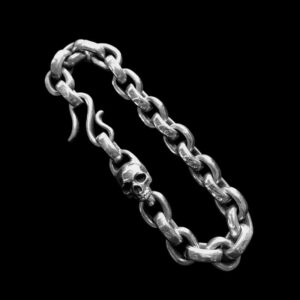
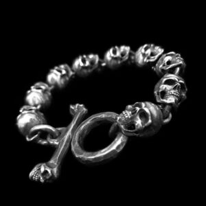
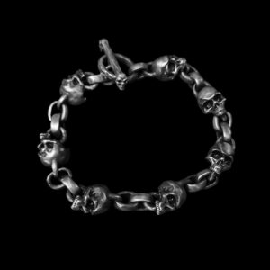
A bracelet introduces repetition through links, segments, or a continuous outline. Because it moves beside the hand, it can visually connect with rings. Decide whether that connection should be strong or restrained. The men’s bracelet category provides current silhouettes for comparison, but it does not prove comfort, performance, or compatibility.
If rings lead, reduce bracelet contrast, scale, or surface complexity. If the bracelet leads, use fewer or quieter ring faces. Detailed same-hand placement belongs to the ring-and-bracelet placement owner; link outward rather than turning this dark-aesthetic guide into a placement tutorial.
Frame a Pendant With the Neckline
A pendant depends on the field around it. An open collar can create a clear frame, while a graphic shirt or layered neckline can add nearby shapes that compete. Compare the pendant’s outer contour first, then its internal detail. The silver pendant category can illustrate observable frame shapes and relief density. It is commercial navigation only and does not verify meaning, chain compatibility, or material identity.
For a pendant-led composition, keep the shirt area around the piece relatively quiet and lower the contrast at the wrist and hand. For a ring-led composition, the pendant can become a small center-line echo or disappear entirely. Empty space is a valid supporting choice.
Use a Subtraction Test
Build the planned outfit, then remove one accessory at a time. After each removal, ask whether the visual story becomes clearer, weaker, or unchanged. If removing a piece changes nothing, it may be unnecessary. If removing it makes the lead less clear, it was probably supporting the composition. If removing it suddenly reveals a different focal point, the original arrangement may have contained competing leads.
- Identify the intended focal zone.
- View the outfit at conversational distance.
- Remove the quietest-looking piece first.
- Compare silhouette balance, contrast, and empty space.
- Repeat until every remaining piece has a distinct visual job.
This test does not require a fixed maximum number of accessories. It asks whether each item contributes to hierarchy or simply adds density.
Common Dark-Composition Errors
Every piece has the same contrast
Equal contrast makes several items demand attention at once. Reserve the strongest separation for the lead and reduce it elsewhere.
Several motifs compete in one zone
Dense repetition can work when it reads as one deliberate family. Unrelated high-detail motifs often create separate stories. Choose one motif leader and simplify the support.
The product image becomes the outfit plan
A listing image cannot account for the wearer’s jacket, graphics, watch, eyewear, or other accessories. Rebuild the decision around the full outfit.
Dark is treated as a personality claim
Visible choices do not prove identity, confidence, attraction, or belonging. Describe silhouette, contrast, repetition, and spacing instead.
A Five-Step Dark Jewelry Plan
- Select one focal zone: hand, wrist, or neckline.
- Set the lead: give that zone the clearest outline, strongest contrast, or most isolated detail.
- Add one support: repeat a single visible cue at lower intensity.
- Protect space: leave another zone quiet or reduce nearby outfit detail.
- Run subtraction: remove pieces until every remaining element has a clear job.
The plan works across product categories because it is based on observable relationships rather than labels. It also keeps the article separate from product browsing, ring count, hand placement, and specialist interpretation.
Claim Boundary
Final Composition Check
- One focal zone is clearly named.
- The lead has the strongest outline, contrast, isolation, or detail.
- Supporting pieces repeat only one or two visible cues.
- At least one zone provides negative space.
- Jewelry density has been compared with outfit density.
- Ring count and ring-bracelet placement questions are routed to their owners.
- No visual choice has been converted into a history, meaning, identity, or performance claim.
A dark jewelry composition does not need maximum weight or maximum detail. It needs a readable order. Choose what leads, decide what supports it, and let the remaining space do part of the work. When the hierarchy is clear, strong silhouettes and dark contrast can look deliberate rather than crowded.




MENSSKULL Journal Notes
Leave a field note
Share fit notes, styling ideas, care questions, or your experience with MENSSKULL silver jewelry.
Comments are checked before publication so buyers can read useful fit, symbolism, care, and style notes without spam noise.
The simple plus/minus challenge below helps block automated spam while keeping the experience lightweight.
Continue exploring
More MENSSKULL stories
Handcrafted silver
Shop the pieces behind the stories