

An alternative wedding ring can be compared as a visual object before any discussion of materials, sizing, tradition, or relationship meaning. Start with what can be seen: the band’s apparent width, the rhythm of its surface detail, the contrast between light and dark areas, the visibility of an inlay, and the amount of attention the ring asks for within an outfit.
This guide is deliberately narrow. It does not decide whether a ring fits, feels comfortable, lasts, resists scratches, can be resized, carries a particular meaning, or suits a legal or ceremonial requirement. It also does not rank materials, prices, or relationship outcomes. Those questions need their own evidence and owners.
Quick answer: compare the visual profile before the label
Choose the profile that best matches the wearer’s existing visual habits. A continuous-detail band creates an all-around pattern. A two-tone band uses color contrast as the main feature. A dark-frame ring with a visible inlay creates a sharper boundary and a more graphic focal point. None of these profiles is universally more appropriate, meaningful, or valuable.
If the wearer already chooses quiet accessories, begin with lower contrast and fewer competing details. If the wearer repeatedly chooses visible motifs, layered textures, or strong light-dark boundaries, a more graphic profile may be coherent. Repeated wardrobe choices are useful observations, not proof of personality.
Separate visual comparison from commercial browsing
This page owns the informational decision: how different band profiles read at a glance and within an outfit. The alternative wedding rings collection owns current commercial assortment, availability, selectable options, and product-level details. The men’s silver rings collection offers broader ring navigation.
Keeping those roles separate prevents a visual guide from turning a product name into evidence about construction, performance, or suitability. Use this page to narrow the look; use the current listing to verify the item itself.
Use apparent width to set visual weight
A band can look narrow, balanced, or broad depending on its visible surface and how much of the finger it appears to cover. Apparent width affects visual weight even when no measurement is stated. A broader-looking face usually occupies more of the hand composition, while a slimmer-looking band leaves more negative space around it.
Judge width from several product images rather than one close crop. Macro photography can make every ring look large. Also compare the ring against the wearer’s watch, bracelets, and other rings. This is a composition check only, not size or fit advice.
Read surface detail as a rhythm
Repeated knots, grooves, ridges, or engraved-looking marks create rhythm across a band. Dense repetition can make the surface feel active from multiple angles. Larger, more separated details create pauses and may read more clearly from a distance. A nearly plain surface makes outline and finish contrast do more of the visual work.
Ask whether the surface should be the first thing noticed or whether it should support the overall silhouette. Do not assign historical, cultural, spiritual, or relationship meaning to a pattern unless a separate, properly reviewed source supports that specific claim.
Compare contrast before color names
Contrast describes how strongly adjacent areas separate from one another. Light-dark contrast, a bright edge against a darker center, or a different-toned accent can divide a band into visible zones. Low contrast makes the band read as one continuous form; higher contrast makes borders and internal shapes easier to notice.
Look at the ring beside the wearer’s usual clothing and accessories. A high-contrast band may echo dark hardware or become an isolated focal point. A lower-contrast band may blend with nearby metal details. This is an outfit observation, not a statement about quality, finish life, or material performance.
Use inlay visibility as a focal-point decision
An inlay can appear as a narrow stripe, a broken pattern, or a central field held inside a darker frame. The key visual question is whether the inlay should be obvious from normal viewing distance or mainly reward close inspection. Strong framing increases separation; subtle framing lets the inlay merge more gently with the band.
Inlay color or pattern should not be used to infer durability, authenticity, origin, or symbolism. Product photography can show the visible arrangement, but product-specific construction facts belong to the listing.
Three current profile examples
| Current listing | Observable profile | Visual question |
|---|---|---|
| Celtic Knot Alternative Wedding Ring | Repeating knot-detail surface with continuous pattern activity | Should the band show detail around much of its visible surface? |
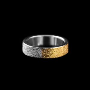
| Two-Tone Promise Ring for Men | Two-tone contrast with a comparatively restrained band outline | Should color separation lead more than raised surface detail? |
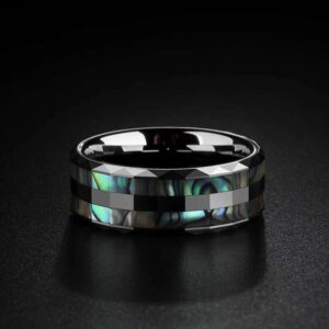
| Black Tungsten Abalone Shell Wedding Band | Dark outer frame with a visibly patterned inlay | Should the center field become the clearest focal point? |
These are current listing identities and visual examples only. Their names do not prove material quality, performance, wedding suitability, commitment meaning, fit, comfort, value, or longevity. Verify all current product details on the listing before making a commercial decision.
Decide how prominent the ring should be
Visual prominence comes from several features working together: apparent width, contrast, surface density, inlay visibility, and the number of other accessories nearby. A detailed ring can look quieter when surrounded by similarly active accessories. A simple dark-framed band can look more prominent when it is the only visible hand accessory.
Use a full-outfit view where possible. Close-up product images are useful for detail but weak for judging prominence. The goal is not to make every ring a statement piece; it is to decide whether the ring should lead, support, or quietly complete the hand composition.
Match the band to existing wardrobe cues
Look for repeated visual cues in the wearer’s wardrobe: matte or reflective hardware, dark or light palettes, plain or patterned surfaces, and compact or oversized accessories. A band that repeats one of those cues can feel visually connected to the outfit without requiring a story about identity.
- Dark hardware: compare how a dark frame relates to buckles, watch cases, or eyewear.
- Patterned clothing: decide whether a detailed band should echo the pattern or provide a quieter counterpoint.
- Minimal accessories: check whether one visible contrast feature is enough.
- Layered accessories: avoid making every item compete at the same visual intensity.
Wardrobe compatibility is a visual judgment, not a guarantee of social approval, personal meaning, or suitability for every occasion.
Compare profiles with a simple matrix
| Profile | Primary visual cue | Often reads most clearly when |
|---|---|---|
| Continuous detail | Repeated surface rhythm | The wearer already uses patterned or textured accessories |
| Two-tone contrast | Separation between adjacent color zones | The outfit includes mixed hardware or restrained shapes |
| Dark frame and inlay | Graphic border around a visible center field | The ring is intended to become a distinct hand focal point |
| Low-detail band | Outline and negative space | The rest of the hand composition is already visually active |
The matrix describes appearance, not fixed rules. The same ring can read differently under different lighting, photography, clothing, and accessory combinations.
Keep customization as a separate decision
Changing a ring’s visible details, adding text, or requesting a different design is a separate path from comparing existing profiles. Use the custom silver rings guide for that decision. This page does not promise that a specific surface, inlay, or engraving request is available or appropriate.
A visual preference can still help a custom discussion: bring examples of the contrast level, surface density, and apparent width you prefer. Product feasibility and final specifications must be confirmed separately.
Route size and fit questions outward
Do not estimate ring size from apparent band width, a photograph, or another ring’s visual profile. A ring that looks broad is not automatically tight, loose, comfortable, or uncomfortable. Use the men’s ring size and fit research guide for measurement and fit questions.
This visual guide intentionally excludes comfort, safe-wear, resizing, and injury guidance. Those topics require evidence beyond appearance.
Route meaning questions to the meaning owner
Wedding, promise, knot, dark, or inlay labels may carry different personal associations. This page does not assign universal symbolism, cultural rules, religious meaning, commitment level, or relationship status. For the separate question of finger placement and common meaning frameworks, use the men’s ring finger meaning guide.
A personal meaning can be discussed between the people involved without turning it into a universal claim. The visual profile remains the page’s only decision scope.
A six-step visual-profile decision
- Collect two or three rings the wearer already chooses voluntarily.
- Compare their apparent width and overall hand coverage.
- Note whether surface detail, color contrast, or an inlay leads the design.
- Place the preferred profile beside the wearer’s usual watch, bracelets, and clothing hardware.
- Choose whether the ring should lead, support, or stay quiet within the outfit.
- Verify size, product details, availability, and any personal meaning through their proper sources.
If two profiles remain equally plausible, compare them together rather than inventing certainty. A collaborative choice can preserve the surprise of the occasion while avoiding unsupported assumptions.
Common comparison mistakes
Do not judge prominence from one macro image, treat a product name as material evidence, or assume a dark ring has one fixed meaning. Do not claim that a knot pattern is traditional for every wearer, that a two-tone band is more formal, or that an inlay makes a ring more valuable or durable.
Avoid turning observable appearance into claims about personality, masculinity, commitment, legality, social status, or relationship success. Also avoid using visual width to predict size, fit, comfort, or safe wear.
Final check before narrowing the shortlist
Describe the choice in one visual sentence: “I prefer the continuous detail,” “I want the two-tone separation to lead,” or “I want the dark frame and inlay to become the focal point.” If the sentence stays observable, the comparison remains within this guide’s scope.
This framework can compare apparent band width, surface detail, contrast, inlay visibility, visual prominence, and wardrobe compatibility. It cannot promise sizing, fit, comfort, safety, material quality, care results, durability, scratch resistance, engraving performance, symbolism, legal suitability, price, value, commitment meaning, social approval, or relationship outcomes.








MENSSKULL Journal Notes
Leave a field note
Share fit notes, styling ideas, care questions, or your experience with MENSSKULL silver jewelry.
Comments are checked before publication so buyers can read useful fit, symbolism, care, and style notes without spam noise.
The simple plus/minus challenge below helps block automated spam while keeping the experience lightweight.
Continue exploring
More MENSSKULL stories
Handcrafted silver
Shop the pieces behind the stories