
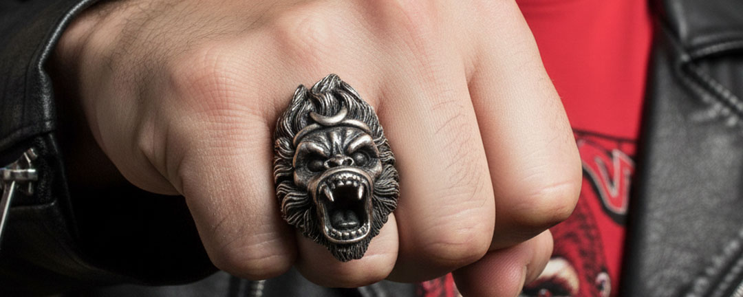
Men’s rings can be visually noticeable, but noticeability is not the same as attraction, approval, confidence, status, or a predictable first impression. A ring becomes easier to see when its silhouette, contrast, finish, movement, and surrounding accessories give it more visual emphasis. Those are observable design relationships. They do not tell us what another person will think.
This guide helps you judge visual prominence before choosing a ring. It does not interpret psychology, assign meaning to a finger, prescribe fit, or make claims about materials, care, comfort, safety, durability, or performance. Those questions belong to separate owners and evidence.
Quick answer: noticeability is a visual property
A ring is usually more noticeable when it has a larger visible silhouette, stronger contrast against the hand or outfit, raised detail, a distinct finish, or little competition from other accessories. It may appear quieter when its outline is compact, its finish blends with nearby details, or several accessories share attention.
None of those conditions proves that a ring attracts people, changes judgment, signals confidence, or creates a favorable response. They only help estimate how quickly the object itself may register in an outfit.
Start with silhouette, not a personality label
Silhouette is the outer shape seen from a normal viewing distance. A compact band creates a narrow interruption around the finger. A high-relief figure, broad signet face, or extended helmet shape creates a larger outline. The larger outline often occupies more visual space, but it is not automatically better, bolder, more masculine, or more appropriate.
Look at the ring from above and from the side. A face that spreads across the finger can read differently from a design that rises vertically. Describe what you can see: compact, broad, tall, angular, rounded, framed, or irregular. Avoid turning those observations into claims about the wearer.
Use contrast to estimate visual emphasis
Contrast can come from several places. A bright edge beside a dark recess creates internal contrast. A darkened ring against a light shirt cuff can create outfit contrast. A polished-looking detail beside a matte-looking surface can make one area stand out. Contrast directs the eye within the composition, but it does not guarantee attention from any particular person.
| Visible factor | What to observe | How to use the observation |
|---|---|---|
| Outline contrast | How clearly the ring edge separates from the hand and sleeve | Compare the full shape at normal viewing distance |
| Surface contrast | Bright and dark areas within the design | Notice which detail becomes the first focal point |
| Color contrast | Difference between the ring, clothing, watch, and bracelet | Judge whether the ring blends with or separates from nearby items |
| Scale contrast | Difference between a ring face and the other visible accessories | Decide whether the ring leads or supports the accessory group |
Finish changes what the eye reads first
A design with strong bright-dark separation may reveal relief detail quickly. A more uniform-looking surface can make the outer silhouette more important than the interior texture. The useful question is not which finish is universally more noticeable. Ask whether the finish creates a distinct focal point in the specific outfit.
Do not use appearance alone to infer material quality, wear behavior, care needs, scratch resistance, or durability. If material evidence matters to the purchase, use a dedicated source rather than treating a photograph as proof.
Ring count redistributes attention
One ring can act as a single focal point. Several rings can create a repeated pattern across the hand. The additional objects may increase the total amount of visible jewelry while dividing attention among multiple shapes. That is an accessory-balance question, not a confidence or status rule.
For a broader discussion of multi-ring composition, use the ring-count guide. This page keeps the narrower task of judging how visible a particular ring profile appears.
Hand movement can reveal or hide detail
Hands move through ordinary tasks, so a ring is not always viewed from the same angle. Raised detail may catch the eye from the side, while a broad top surface may be most visible when the hand is open. A cuff or pocket can temporarily cover part of the shape. These are observations about changing views, not promises about social attention.
When comparing designs, rotate the product view if reliable images are available. Check the top, side, and diagonal outlines. Avoid assuming that one carefully lit front image represents every real-world view.
Balance the ring with watches and bracelets
A watch, bracelet, cuff hardware, or patterned sleeve can compete with a ring for visual priority. If the wrist already has strong detail, a large ring may join a dense accessory group rather than stand alone. If the wrist is visually quiet, the ring may become the leading metal detail.
Use accessory hierarchy deliberately. Choose one leading detail, then decide whether the other items should echo its shapes or remain quieter. This does not require removing accessories; it simply makes their visual roles clearer.
Compare two current high-relief profiles
Current MENSSKULL listings provide two useful examples of visible silhouette differences. They are comparison anchors, not rankings and not evidence of attraction, psychology, popularity, fit, comfort, material performance, or durability.
| Current example | Observable visual feature | Question to ask |
|---|---|---|
| Heavy Roaring Wukong Ring | High-relief figure silhouette with multiple raised facial and head details | Does the figure shape become the clear focal point beside the wearer’s other accessories? |
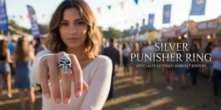
| Helmeted Biker Skull Ring | Helmeted skull outline with visible surface contrast and a framed head shape | Does the helmet outline create the level of visual separation wanted for the outfit? |
The listing names identify the current products. They do not establish weight on the hand, comfort, safe wear, material quality, resistance to damage, or a predictable reaction from other people.
Separate finger choice from visual noticeability
Finger placement can change where a ring appears within the hand, but this page does not assign social, historical, marital, or universal meaning to that placement. If meaning is part of your question, consult the dedicated ring-finger meaning guide and keep its evidence boundaries in view.
Likewise, visual placement does not determine size or safe fit. Route measurements and fit decisions to the men’s ring size and fit research guide. Do not infer fit from how a ring looks on a model or in a cropped product image.
Judge the ring in an outfit, not in isolation
Product photography is designed to show detail. An outfit changes the context. Place the ring beside the colors, textures, sleeve shapes, watch, and bracelet the wearer actually uses. A detailed ring against a plain cuff can become a focal point; the same ring beside several textured accessories may share attention.
For party or concert coordination, use the separate one-skull-ring event styling guide. It owns that occasion-specific decision. This page remains about everyday visual noticeability.
A practical visibility test
- Open a clear top and side image of the ring.
- Describe the silhouette without personality words.
- Identify the brightest, darkest, or highest-relief focal area.
- List the watch, bracelet, and sleeve details likely to appear nearby.
- Decide whether the ring should lead, support, or share attention.
- Check the result at normal outfit scale rather than only in a close-up.
This test produces a visual decision, not a psychological prediction. If two profiles work equally well, personal preference is a sufficient tie-breaker.
Common claims to avoid
A visible ring does not prove that someone is confident, rebellious, successful, fashionable, masculine, or socially approved. It does not control attraction or guarantee a first impression. Public discussions about rings can show that buyers ask these questions, but they cannot establish another person’s response.
Also avoid using finish, darkness, relief, or product names as proof of material quality, comfort, safe wear, durability, or performance. Browse the men’s silver ring collection for commercial options, and use the custom ring decision guide when the shape itself needs to be personalized. Those destinations do not replace product-specific verification.
Final decision: choose the level of visual presence
Ask one clear question: should this ring be the first jewelry detail visible, a supporting detail beside a watch or bracelet, or one repeated element in a multi-ring arrangement? Then compare silhouette, contrast, finish, movement, and competition from nearby accessories.
The result can tell you how prominent the ring looks in a composition. It cannot promise attraction, approval, confidence, status, meaning, fit, comfort, safety, material performance, durability, popularity, or a favorable first impression. Keeping those boundaries clear makes the visual decision more useful and more honest.







MENSSKULL Journal Notes
Leave a field note
Share fit notes, styling ideas, care questions, or your experience with MENSSKULL silver jewelry.
Comments are checked before publication so buyers can read useful fit, symbolism, care, and style notes without spam noise.
The simple plus/minus challenge below helps block automated spam while keeping the experience lightweight.
Continue exploring
More MENSSKULL stories
Handcrafted silver
Shop the pieces behind the stories