

To wear one skull ring without making the outfit feel costume-like, give the ring one clear visual job. Let it be the main hand-level focal point, keep nearby details quieter, and repeat only one or two cues such as silver tone, dark color, or worn texture elsewhere in the outfit. The goal is not to hide the skull. It is to make the ring look intentionally connected to the rest of what you are wearing.
This is an outfit-coordination decision, not a universal dress rule. A compact skull face, an elongated coffin shape, and a larger full-face design create different amounts of visual weight. You can assess that visible difference without assigning a fixed meaning, personality, status, or subculture identity to the wearer.
Start with one focal point on the hand
A skull ring already contains a recognizable motif. If every nearby accessory is equally detailed, the eye has no clear place to settle. Begin with one ring and decide whether it should lead the hand. Then reduce competition from additional rings, a highly detailed watch, stacked bracelets, prominent cuff hardware, or several contrasting metals.
Reducing competition does not mean every other accessory must disappear. It means the skull ring should have a clear rank in the visual hierarchy. A simple watch case can repeat its metal tone. A plain bracelet can form a secondary line. Neither needs to introduce another large motif beside it.
Use visible face size to estimate visual weight
Visual weight describes how strongly an object attracts attention in a composition. For rings, the visible face outline, height, width, contrast, relief, and surrounding negative space all contribute. Product dimensions help compare scale, but they do not determine how a ring will look on every hand or how it will feel.
| Current catalog example | Listed face size | Observable styling role |
|---|---|---|
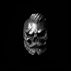
| No Jaw Skull Ring | 23 x 21 mm | Compact skull outline that can act as a contained hand-level focal point |
| Coffin Seal Skull Ring | 35 x 34 mm | Elongated coffin frame with a broader graphic area |
| Classic Skull Ring | 35 x 25 mm | Taller skull profile with a narrower face than the coffin-shaped example |
These are current listing facts, not a ranking from subtle to best. The NIST SI length reference supports interpreting millimeter measurements only. It does not establish fit, comfort, quality, durability, or styling suitability. Recheck the current product listing before ordering because options and availability can change.
Coordinate the ring with the outfit’s detail density
Detail density is the amount of visible information grouped in one area. A plain sleeve and simple cuff create a quiet setting, so a carved skull can become the obvious feature. A patterned shirt, textured jacket, decorated watch, and multiple bracelets create a denser setting. In that case, the ring may need more surrounding visual space to remain deliberate.
Look at the full upper body rather than the hand alone. If the shirt graphic, jacket hardware, necklace, watch, and ring all compete, remove one element and compare again. The related guide on whether men should wear jewelry with every outfit owns the broader add, repeat, or skip decision. This page assumes the skull ring is staying and focuses on integrating it.
Repeat metal tone without forcing an exact match
Repetition makes separate details feel connected. A silver-colored ring can echo a watch case, belt hardware, eyewear detail, or necklace without requiring every object to be identical. One repeated cue is often enough to show intent. Exact matching can work, but it is not the only organized result.
If several metal colors are present, decide which one leads and which one supports. The skull ring may be the leading silver-toned element while smaller warm-toned hardware remains secondary. Judge the visible arrangement, not an assumed rule about which metals people are allowed to combine.
Echo texture rather than adding another motif
A skull face can contain deep recesses, polished ridges, smooth planes, teeth, or a surrounding frame. Instead of adding a second figurative symbol, repeat one texture elsewhere. Worn leather, matte fabric, brushed hardware, faded denim, or a clean polished buckle can connect with part of the ring’s surface language.
Texture echo is different from product-performance evidence. A ring that visually resembles worn leather does not acquire the properties of leather, and a polished surface does not prove material quality. For verified silver composition and hallmark boundaries, use the 925 sterling silver Research owner rather than drawing conclusions from appearance.
Use color contrast deliberately
Dark clothing can make bright edges and raised details more visible. A light or mid-tone sleeve can reveal the full silhouette more evenly. Neither background is automatically more appropriate. The question is whether the contrast supports the role you selected for the ring.
Try three controlled comparisons: dark sleeve, light sleeve, and one textured or patterned sleeve. Keep the ring and lighting unchanged. If the motif disappears, increase contrast. If it overwhelms every other detail, reduce nearby contrast or simplify the wrist area. This test treats color as a visible relationship rather than a personality claim.
Treat finger placement as composition, not identity
Changing fingers changes spacing between the skull ring, adjacent rings, watch, cuff, and the outside edge of the hand. That makes placement a composition choice. It does not assign a fixed message to the wearer, and this guide does not prescribe which finger is physically suitable.
Photograph the ring on more than one intended finger and compare the surrounding negative space. If measurement or fit is the real question, use the men’s ring size and fit Research guide. Keep physical sizing separate from the visual-placement decision covered here.
Choose quiet supporting accessories
Supporting accessories should reinforce the ring without demanding the same level of attention. A plain chain, simple watch case, restrained bracelet, or unadorned belt buckle can repeat a line or metal tone. If another accessory has a large emblem or heavily modeled surface, decide which piece is primary before wearing both.
| What you see | What it may indicate visually | First comparison to try |
|---|---|---|
| The ring disappears beside a detailed watch | Two hand-level focal points have similar strength | Keep the ring and test a quieter watch or bare wrist |
| The ring feels disconnected from the outfit | No color, metal, or texture cue repeats elsewhere | Repeat one cue in a small accessory or garment detail |
| The hand area looks crowded | Too many motifs or hard edges share a small space | Remove one adjacent ring or wrist accessory |
| The skull face lacks definition | Background and ring have similar visible contrast | Compare a sleeve with a different value or texture |
| The outfit looks deliberately coordinated | The ring leads while other details repeat or support it | Keep the hierarchy and avoid adding another equal focal point |
Keep skull meaning outside the outfit-balance decision
A skull can be read in many personal, cultural, historical, artistic, or commercial ways. This page does not assign one fixed interpretation. If meaning is important to the decision, use the dedicated skull ring symbolism and meaning guide and keep its sourced context separate from the visible outfit test.
That separation also avoids using the ring as a shortcut for claims about masculinity, confidence, rebellion, status, or character. An outfit can look coordinated because its colors, textures, scale, and focal points relate clearly. No personality claim is required.
Separate outfit integration from ring-form comparison
This owner answers how to integrate one skull ring with an outfit. It does not own the larger comparison among statement-ring forms. The protected guide to men’s statement-ring designs retains that intent. Link outward when the buyer is still choosing among broad design types.
Once the buyer has selected a skull ring, return here for focal-point control, placement, repeated metal tone, texture echo, and color balance. Keeping those decisions separate prevents a broad catalog comparison from becoming an unsupported claim that one form always coordinates better.
Build the outfit in a fixed sequence
- Choose the clothes first and identify the current focal point.
- Add one skull ring and decide whether it should lead the hand.
- Remove competing motifs near the ring.
- Repeat one metal, color, or texture cue elsewhere.
- Check the full outfit from normal viewing distance.
- Take a photo, remove one supporting accessory, and compare the two versions.
This sequence works because it changes one variable at a time. It also makes the broader skull-ring styling guide easier to use: that page can supply additional styling context while this owner remains focused on a single ring and one outfit.
Use the two-photo subtraction test
Take one straight-on photo with the complete outfit and another after removing the nearest competing accessory. Use the same lighting, pose, sleeve position, and crop. If the second version makes the ring and outfit easier to read together, the removed item was probably competing. If the first version looks more connected, the supporting accessory may have provided a useful repeated cue.
Then test the opposite direction by adding only one small repeat, such as a metal buckle or simple chain. Do not change the ring, clothing, and several accessories at once. The subtraction test is most useful when the comparison remains controlled.
Common outfit-integration mistakes
Making every accessory a focal point: several large motifs in one area can flatten the hierarchy. Choose a leader and supporting details.
Choosing only from a close-up product image: close-ups reveal carving but not the ring’s role in a full outfit. Compare the current listing, then use a full-length mirror or photo.
Using listed dimensions as a fit promise: dimensions support scale comparison only. Physical fit belongs to the ring-fit Research owner and the current product options.
Assuming every skull communicates the same message: meaning depends on context and interpretation. This page does not convert a motif into an identity claim.
Forcing every metal to match exactly: visible repetition can organize an outfit without making every accessory identical.
Adding more detail when the ring already leads: if the composition is clear, stop. Extra symbols are not automatically an improvement.
A five-step final check
- Can you identify the main hand-level focal point immediately?
- Does one color, metal tone, or texture connect the ring to the outfit?
- Are nearby accessories supporting rather than competing?
- Does the ring remain readable from normal viewing distance?
- Would removing one element make the hierarchy clearer?
If the answers are clear, the skull ring is functioning as an intentional part of the outfit. For wider browsing, compare the skull ring collection and the broader men’s silver ring collection. Those category pages support navigation, not claims that any particular ring is universally stylish, suitable, or superior.
The practical rule
Let one skull ring lead, keep the surrounding hand area quieter, and repeat one visible cue elsewhere. Compare the result in a full-outfit photo rather than judging the ring in isolation. The catalog records and external measurement reference do not prove that one placement, motif, or product is universally fashionable. They provide bounded observations for a personal visual decision.








MENSSKULL Journal Notes
Leave a field note
Share fit notes, styling ideas, care questions, or your experience with MENSSKULL silver jewelry.
Comments are checked before publication so buyers can read useful fit, symbolism, care, and style notes without spam noise.
The simple plus/minus challenge below helps block automated spam while keeping the experience lightweight.
Continue exploring
More MENSSKULL stories
Handcrafted silver
Shop the pieces behind the stories