

A men’s pendant can be compared as a visible shape before any decision about symbolism, chain length, material, fit, or long-term wear. Start with the pendant’s outline, the amount of raised detail, the way a frame contains the central motif, and how strongly the piece separates from the shirt behind it. Those features determine whether the pendant reads as a compact accent, a graphic marker, or the main focal point near the neckline.
This guide stays within that visual decision. It does not interpret skulls, crosses, figures, animals, or cultural motifs. It also does not prescribe chain length, prove compatibility, identify material, predict comfort, or promise durability. Those questions belong to their dedicated owners and the current product listing.
Quick answer: choose the visual job first
Choose a pendant by the job it should perform in the outfit. A compact form can support other visible details. A rectangular dog-tag outline creates a clear vertical marker. A raised figure adds depth and can remain legible against a relatively quiet shirt. A framed pendant separates the motif from its surroundings and can make the outer silhouette as important as the center.
If the outfit already contains strong graphics, visible hardware, or several accessories, begin with a quieter pendant profile. If the neckline area is otherwise simple, a larger outline, stronger relief, or clearer frame can become the main point. This is a composition choice, not a claim about personality, meaning, or social response.
Decide between a plain chain and a pendant
Before comparing pendant forms, decide whether the neckline needs a separate focal object at all. A plain chain creates a continuous line. A pendant interrupts that line with a distinct shape and introduces a vertical center. The plain chain or pendant guide owns that first decision.
Once a pendant is the chosen format, return to this page and compare the outline, relief, frame, contrast, and desired prominence. Keeping those two decisions separate prevents a broad necklace choice from becoming mixed with product-level assumptions.
Start with the outer outline
The outer outline is the fastest part of a pendant to read at normal viewing distance. A rectangle produces a vertical block with defined corners. A compact figure or emblem can create a more irregular edge. A framed form gives the eye two boundaries: the outside edge and the central motif. A narrow pendant leaves more shirt visible around it, while a broad-looking face occupies more of the neckline area.
Judge the outline from a full product image as well as a close view. Macro photography is useful for detail but can make every pendant feel dominant. The useful question is not which outline is best; it is which outline should lead, support, or stay quiet within the intended outfit.
Use relief detail to control visual activity
Relief is the visible projection of a motif from its background. Shallow-looking detail can read as texture until the viewer is close. Stronger-looking relief creates brighter edges and darker recesses in photographs, so the motif separates more clearly from the base. Dense relief can make a small area visually active, while larger, simpler planes can remain easier to read from farther away.
Compare the distribution of detail rather than assigning meaning to it. Ask whether the eye sees one dominant face, several small marks, or a field of lines. This page does not infer craftsmanship, material, production method, or durability from visible relief.
Compare framed and unframed compositions
A frame gives the central motif a defined boundary. On a dog-tag profile, the rectangular plate can act as a visual field behind the motif. If the motif nearly fills that field, the composition reads as dense. If a visible border remains, the eye can separate the figure from the outer shape more quickly.
An unframed or open-edged figure lets the motif define the silhouette directly. That can create a more irregular outline, but it can also make the pendant’s identity depend more heavily on the central shape. Neither approach is universally quieter or more noticeable; the result depends on contrast, scale, clothing, and nearby accessories.
Use shirt contrast as a preview tool
A pendant does not appear in isolation. A light-toned edge can separate strongly from a dark shirt, while a dark field can merge with it and let brighter relief lead. On a lighter shirt, the same balance may reverse. Patterned fabric can compete with small pendant details, while a plain field usually gives the outline more room.
Preview the pendant against colors and pattern densities the wearer actually uses. This is a visual test only. It does not prove that a finish will remain unchanged, that a product is suitable for every garment, or that photography represents every lighting condition.
Choose the desired level of prominence
Prominence comes from several visible factors working together: outline size, contrast, relief depth, border clarity, and the number of competing details nearby. A compact pendant can still lead when it is the only accessory near a plain neckline. A larger pendant can become secondary when the shirt, jacket, and other jewelry already carry strong visual information.
Use three practical roles:
- Quiet accent: a smaller-looking or lower-contrast form that supports the outfit.
- Balanced marker: a clear silhouette that is visible without taking over the entire composition.
- Main focal point: a profile with enough outline, relief, or contrast to lead the neckline area.
These roles describe appearance, not importance, identity, confidence, or status.
Three current visual-profile examples
| Current listing | Observable profile | Useful comparison question |
|---|---|---|
| Brass Skull Inlay Dog Tag Pendant – 925 Silver Plate | Rectangular plate, inset central motif, visible outer border | Should the frame remain easy to see around the motif? |
| Punisher Skull Dog Tag Necklace – 925 Silver Pendant for Men | Dog-tag outline with an elongated raised skull form | Should one vertical relief shape lead the pendant face? |
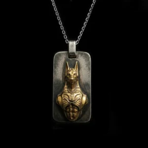
| Raised Anubis Dog Tag Pendant – Sterling Silver | Rectangular frame with a raised figure and multiple internal lines | Should the pendant offer detail for close viewing as well as a clear outer block? |
These names are current first-party listing labels, and the descriptions are limited to visible form. They do not establish material identity, hallmark status, chain compatibility, cultural meaning, product performance, or suitability. Confirm current product details on the listing before making a commercial decision.
Compare the profiles in one matrix
| Profile cue | What the eye notices | Composition question |
|---|---|---|
| Compact outline | A contained shape with more surrounding shirt visible | Should the pendant support rather than lead? |
| Rectangular dog tag | A vertical block with a strong outer boundary | Should the neckline gain a clear center marker? |
| Raised central figure | Light-dark edges and a motif that projects from the field | Should relief detail become the first close-view feature? |
| Visible frame | Separation between the motif and outer edge | Should the border organize a dense center? |
| Low-contrast field | Outline and relief merge more gently | Should the pendant stay visually quieter? |
| High-contrast field | Edges and central details separate quickly | Should the pendant become a stronger focal point? |
The matrix is a starting point, not a fixed ranking. Camera angle, crop, lighting, shirt color, and nearby accessories can change how the same pendant reads.
Coordinate the pendant with neckline visibility
Neckline visibility describes how much uninterrupted shirt area is available around the pendant. An open collar may create a different visible field than a crew neck or layered jacket. This page uses neckline only as a composition boundary: where the pendant appears and how much surrounding fabric the eye can see.
Do not convert that observation into a chain-length prescription. Exact length, position, and fit belong to the men’s necklace chain-length guide. Use that owner when measurements or placement ranges become part of the decision.
Build an outfit around one leading cue
A pendant composition becomes easier to control when one cue leads. That cue might be the rectangular outline, the raised motif, the frame, or the contrast against the shirt. Let the remaining details support that choice rather than competing at the same intensity.
- If the outer shape leads, keep nearby graphics and accessories comparatively restrained.
- If relief leads, give the pendant enough plain background to make its edges readable.
- If contrast leads, repeat that light-dark relationship selectively in another outfit detail.
- If the pendant is meant to support, avoid adding several nearby focal points at the neckline.
This approach manages visible hierarchy. It does not claim that one arrangement is more fashionable, masculine, appropriate, or socially preferred.
Use the category pages for commercial browsing
After selecting a visual profile, use the relevant category to inspect current assortment. The silver pendant collection provides broad commercial navigation. The cross pendant collection, gothic pendant collection, and biker pendant collection narrow the visible design field.
Category labels help navigation; they are not evidence of meaning, identity, popularity, or performance. Keep the informational decision on this page and verify current availability, options, and product facts on the commercial destination.
Route material questions to the evidence owner
Color, reflectivity, and surface contrast can be observed in photographs, but they do not prove composition or quality. If material identity, alloy terminology, or hallmark evidence becomes important, use the 925 sterling silver research guide and the current product listing.
This page does not infer material from color, product naming, price, or photographic appearance. It also does not compare care requirements, maintenance outcomes, or durability.
Keep motif interpretation outside this decision
A skull, cross, animal, figure, or geometric form may carry different associations for different people. This visual-profile guide does not assign a universal story to any motif. It does not interpret religious, historical, or cultural meaning, and it does not use a motif to predict identity or personality.
For this decision, treat the motif as an observable arrangement of shapes, lines, and relief. If interpretation matters, pause the purchase decision until an appropriate reviewed source or the wearer’s own stated preference can guide it.
Compare the pendant at three viewing distances
A useful comparison changes distance instead of relying on one enlarged product image. At close distance, inspect the distribution of relief, the separation between the motif and frame, and the number of small lines competing for attention. At conversational distance, ask whether the motif remains distinct or whether the pendant reads mainly as an outer silhouette. At full-outfit distance, judge whether the pendant still leads the neckline or becomes one detail among several.
The three-distance check helps separate fine detail from overall presence. A pendant can contain extensive close detail but still read as a simple rectangle from farther away. Another can have fewer internal marks yet remain prominent because its outline and shirt contrast are strong. Neither result is automatically preferable; the intended visual job decides which result is useful.
Account for photography without inventing scale
Product pages may include front views, angled views, close crops, and on-body references. Each view answers a different visual question. A front view is useful for outline and frame balance. An angled view can reveal projecting relief. A close crop shows small lines but exaggerates their importance. An on-body image can suggest composition, but it should not be treated as an exact measurement or a promise of how the pendant will sit on another person.
Compare several images and note which observations remain consistent across them. If the rectangular edge, raised center, or border separation is visible repeatedly, it is a stronger basis for the visual comparison. If a feature appears only under one lighting angle, treat it as variable rather than defining. Exact dimensions and chain details still require the current listing.
Make a shortlist without ranking the motifs
A shortlist can be built with neutral visual labels. For example: compact low-contrast accent, framed dog-tag marker, or high-detail raised figure. These labels make it possible to compare composition without calling one motif more meaningful, authentic, fashionable, or important than another.
Keep two candidates when they solve different visual jobs. One may work as a quieter daily outfit accent, while another may be reserved for a simpler shirt where the pendant can lead. This is not a claim about wear frequency, durability, or occasion rules. It is simply a way to preserve distinct composition options instead of forcing unlike profiles into one ranking.
A seven-step pendant-profile decision
- Decide whether the outfit needs a pendant or only a continuous chain line.
- Choose whether the pendant should be a quiet accent, balanced marker, or main focal point.
- Compare compact, rectangular, framed, and figure-led outer shapes.
- Look at how much relief detail is visible from more than one product image.
- Preview the light-dark contrast against shirts the wearer actually uses.
- Keep one leading visual cue and reduce nearby competition.
- Verify length, material evidence, current options, and product facts with their proper owners.
If two profiles remain equally plausible, save both and compare them against the same outfit reference. A consistent comparison is more useful than inventing certainty from a single close crop.
Common pendant-comparison mistakes
Do not treat a product name as proof of material, use a close-up image to predict on-body size, or assume a motif has one fixed meaning. Do not call a pendant popular or trending without current evidence. Avoid claiming that stronger relief proves construction quality, that frame size predicts durability, or that a particular outline suits every wearer.
Do not estimate chain length, fit, comfort, skin response, or safe wear from appearance. Do not infer craftsmanship, value, or performance from price or photographic contrast. Those claims require evidence outside this page’s visual scope.
Final check before narrowing the shortlist
Describe the preferred pendant in one observable sentence: “I want a compact accent with low contrast,” “I want a rectangular frame with one raised focal motif,” or “I want the border and center detail to read separately.” If the sentence stays visual, the choice remains within this guide’s scope.
This framework can compare outline, relief detail, frame shape, shirt contrast, neckline visibility, and desired prominence. It cannot promise history, symbolism, cultural meaning, religious meaning, identity, popularity, material identity, hallmark status, craftsmanship, chain compatibility, care results, maintenance outcomes, durability, comfort, fit, skin response, safety, or performance.







MENSSKULL Journal Notes
Leave a field note
Share fit notes, styling ideas, care questions, or your experience with MENSSKULL silver jewelry.
Comments are checked before publication so buyers can read useful fit, symbolism, care, and style notes without spam noise.
The simple plus/minus challenge below helps block automated spam while keeping the experience lightweight.
Continue exploring
More MENSSKULL stories
Handcrafted silver
Shop the pieces behind the stories